Sustainability Edit
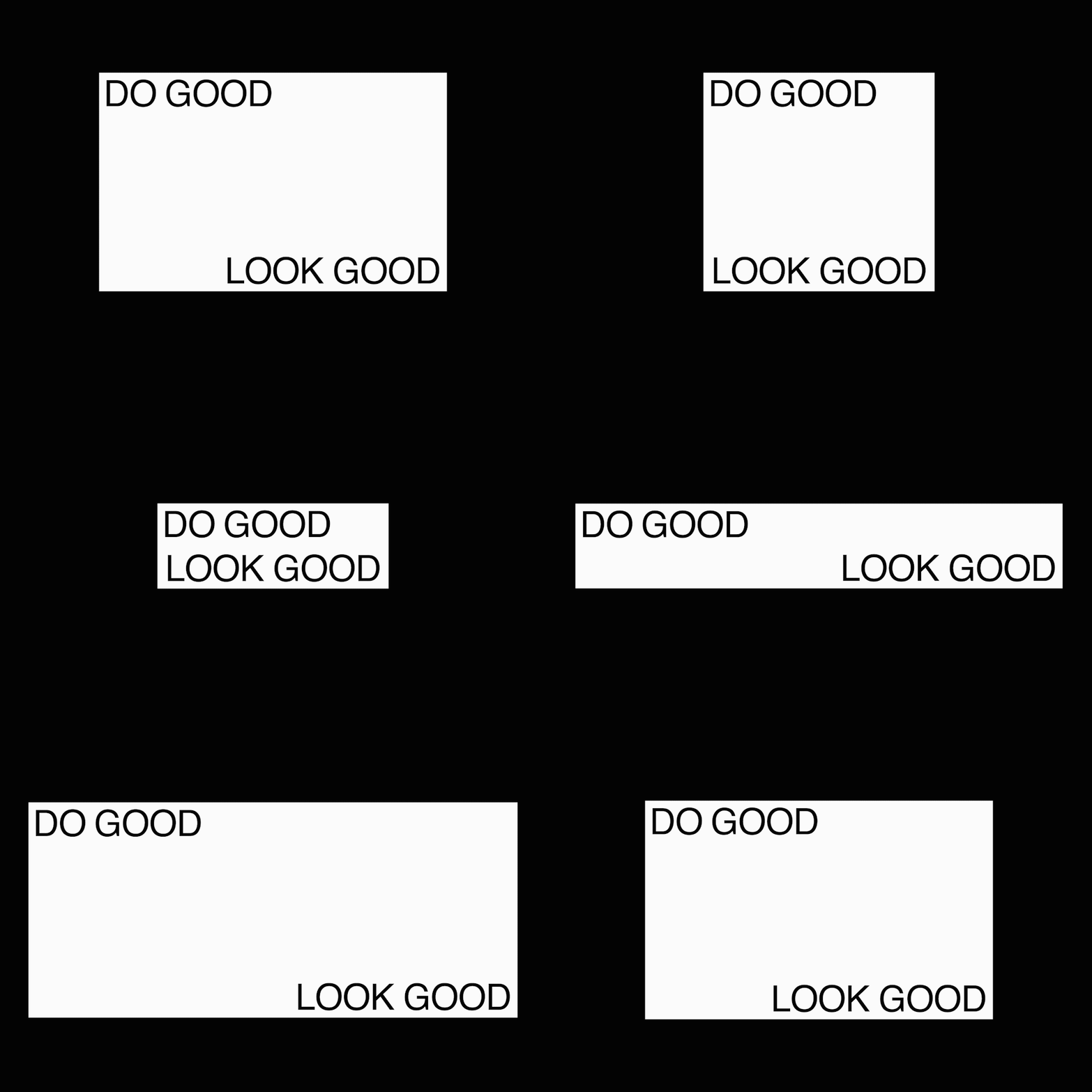
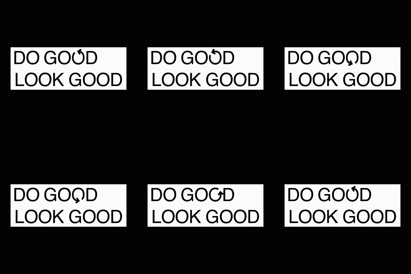
Development work for Ted Baker’s sustainability offering. The process began by taking a utilitarian and minimalistic approach to layouts and typography and building into a strict grid format. The idea was to keep the design feeling honest and almost ‘under-designed’. The title Do Good Look Good struck a positive tone, whilst remaining loose enough to allow flexibility without making any specific claims. This lock-up became responsive and would always be fully justified, solidifying the grid structure.
A series of icons were drawn up to complement and complete the layouts, each one representing a key call-out such as cotton, wool or water. These icons were reduced down to their simplest form to continue the Scandinavian look and feel and to avoid it becoming juvenile and caricatured. Only when overlaid over relevant imagery online or alongside their corresponding messaging on swing tags do they become recognisable.


